A Brief History of the McQuaid Jesuit Logo
The McQuaid Jesuit knight. An iconic staple in New York state athletics and education. This is not just a logo that was randomly picked by the founders of McQuaid Jesuit. This symbol was specifically crafted to represent the ideology of McQuaid and the original founder of the Jesuits. St Ignatius Loyola would be called a knight in today’s time. He fought for his home country of Spain until he was hit in the leg with a cannonball in battle. He luckily survived but was then bedridden for many months. This caused St. Ignatius to pick up books and start reading. One of his favorites was the Bible. This prompted the hospitalized knight to realize his greater purpose was to lead and create the Society Of Jesus. This founding of the order of the Jesuits later prompted the creation of McQuaid Jesuit.
The McQuaid logo was first introduced in 1954 when the school was also created. At this time there was no knight to represent the perseverance of the students. The original logo was a badge or a crest. On the top of the badge there is an open book with the letters A.M.D.G pictured on the pages. It also incorporated St. Ignatius’ Coat of Arms. This is represented by diagonal stripes, a cauldron, and a chain supported by two wolves. This distinguished the House of Loyola in Spain, St Ignatius Loyola’s home country. The main section of the crest holds Bishop McQuaid’s family Coat of Arms. This is pictured as an X with a shamrock in the center. Finally, at the bottom of the crest, the words “Ignem Mittere in Terram” are written out on a banner. This term means “to cast fire on the earth.” This is a metaphor for using one’s own personal talents to help the world in great ways. 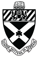
The knight mascot was introduced shortly after the school was founded. The knight represents St Ignatius Loyola as he was a knight himself. McQuaid kept using the crest and an “M” logo for documents, events, and athletic jerseys.
In 2008 the logo was officially changed to the well known cartoon knight carrying a sword. The rebrand was announced at the 2009 BASH event. The title for the event was “A Rich Tradition Gives Rise to… A New Knight”. 
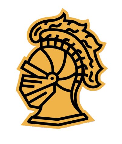
The cartoon knight logo lasted for six years. In 2015 “the plug was pulled on the cartoon,” said Director of Communications, Sean Mullen ’02. The symbol was replaced with many people’s favorite logo, the knight head. It is a simple yet elegant take on the classic knight, and preferred by the masses. The knight head still stands in 2022 and there is no plan for a rebrand any time soon. Despite any logo or badge, the McQuaid Jesuit mentality of hard work and even harder play has stood the test of time since 1954.